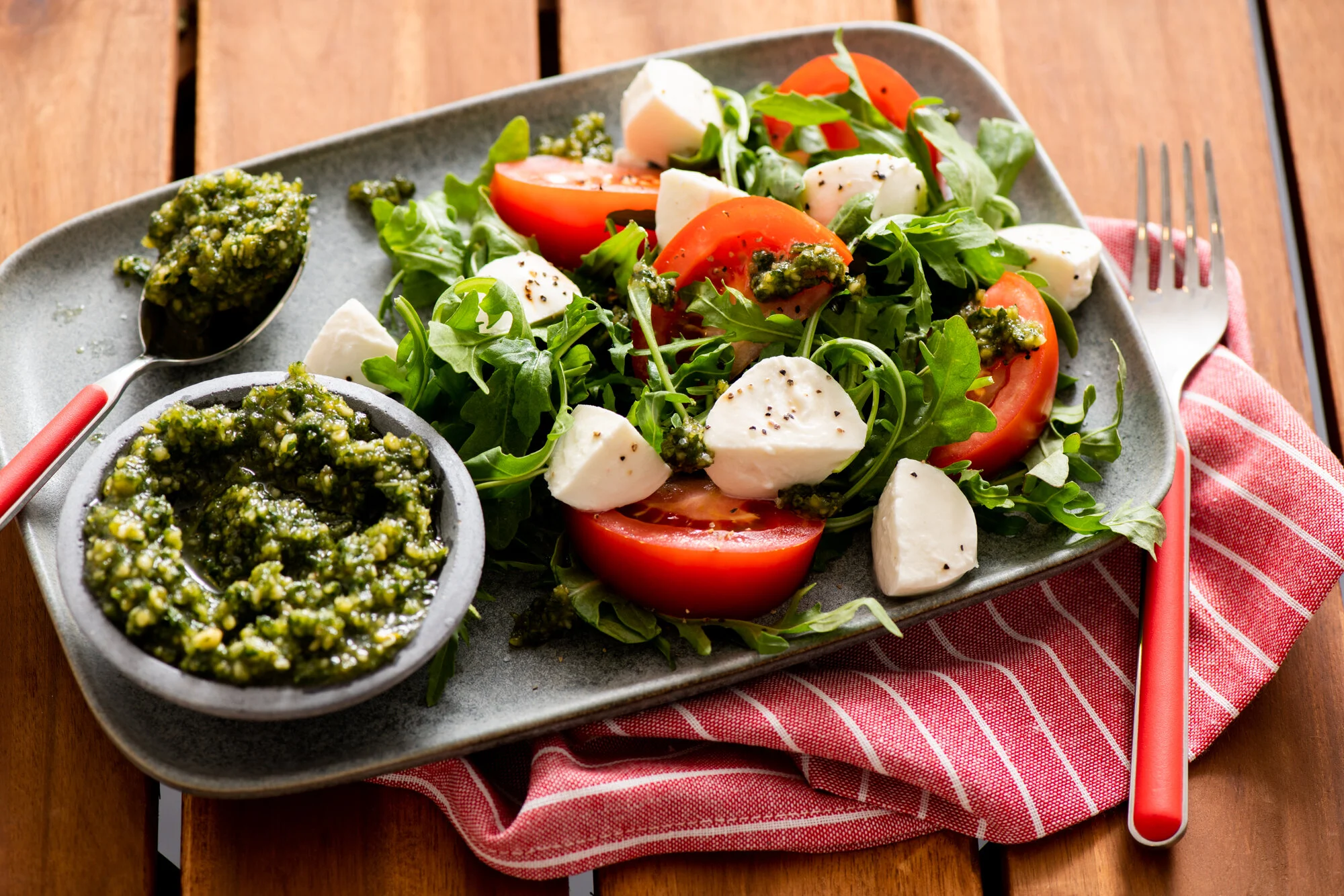
I pride myself on being able to tune into each brand I work with to design photos that fit their brand’s look & feel-whether light and bright or dark and moody. Below I’m featuring several brands in a variety of styles.
As you come up with the new look & feel for Simply Organic, I’m looking forward to being part of that creative process.
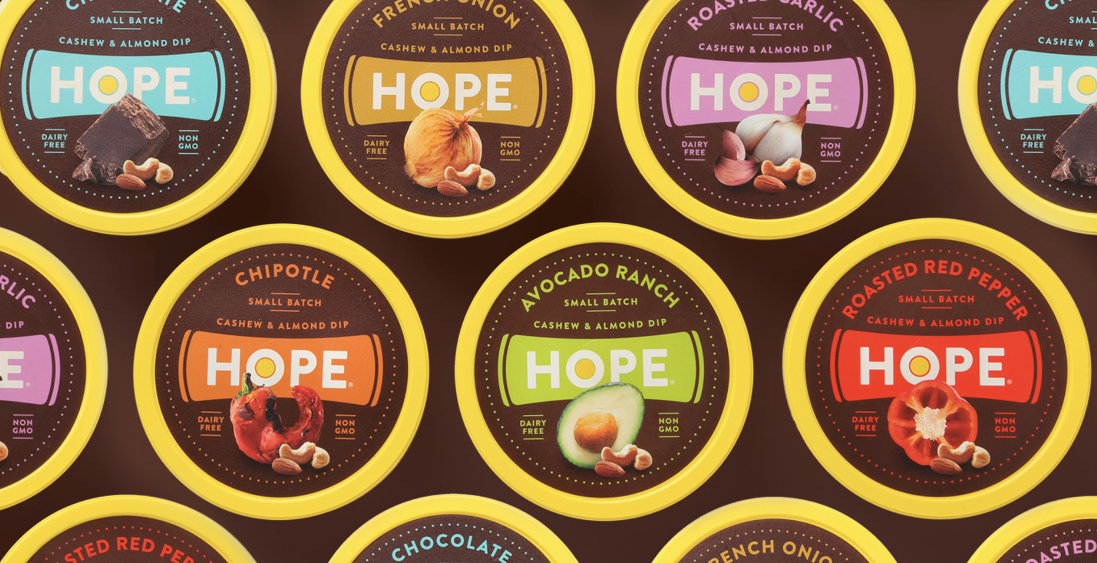
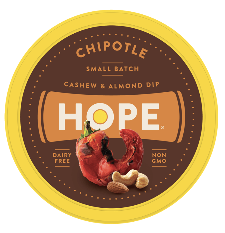
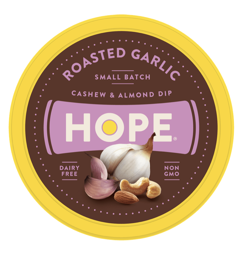
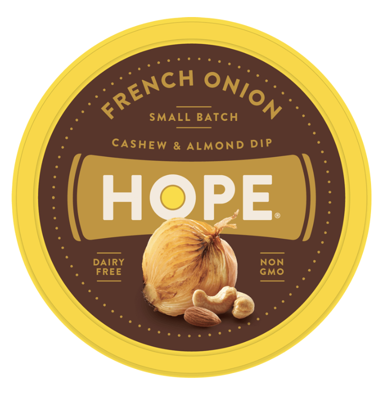
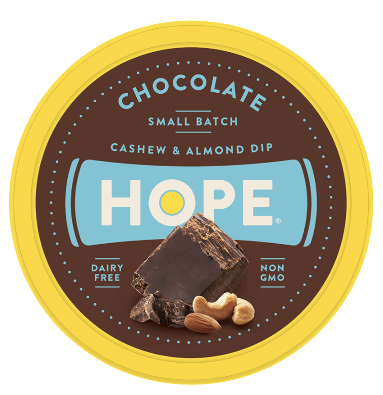
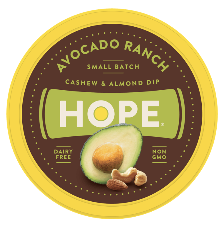
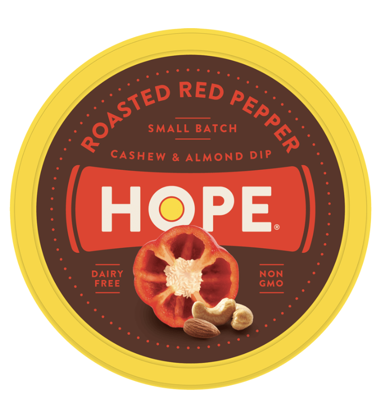
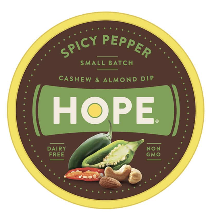
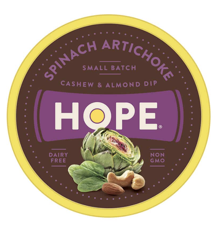
Hope Hummus
Dark and vibrant, ingredient-focused photography. Hope came out with a new line of nut butters, and really wanted the ingredients to lead.
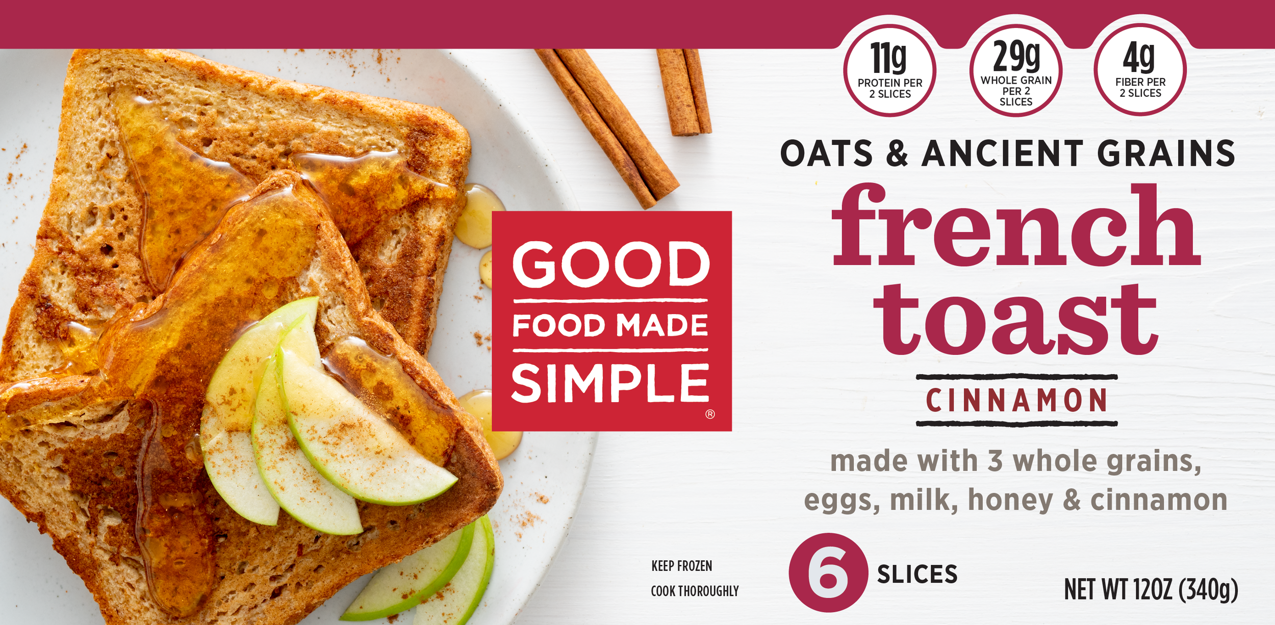
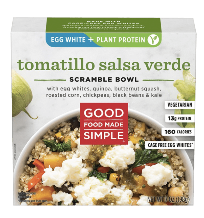
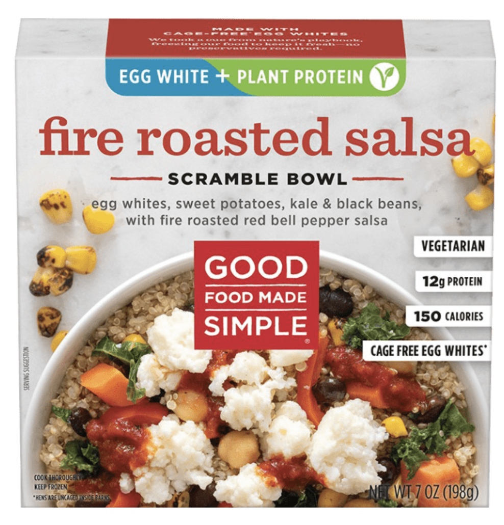
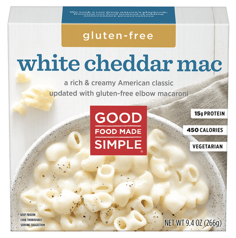
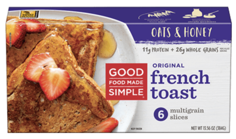
Good Food Made Simple
For a number of years, I’ve worked with Good Food Made Simple to create simple, fresh images of their packaged foods.

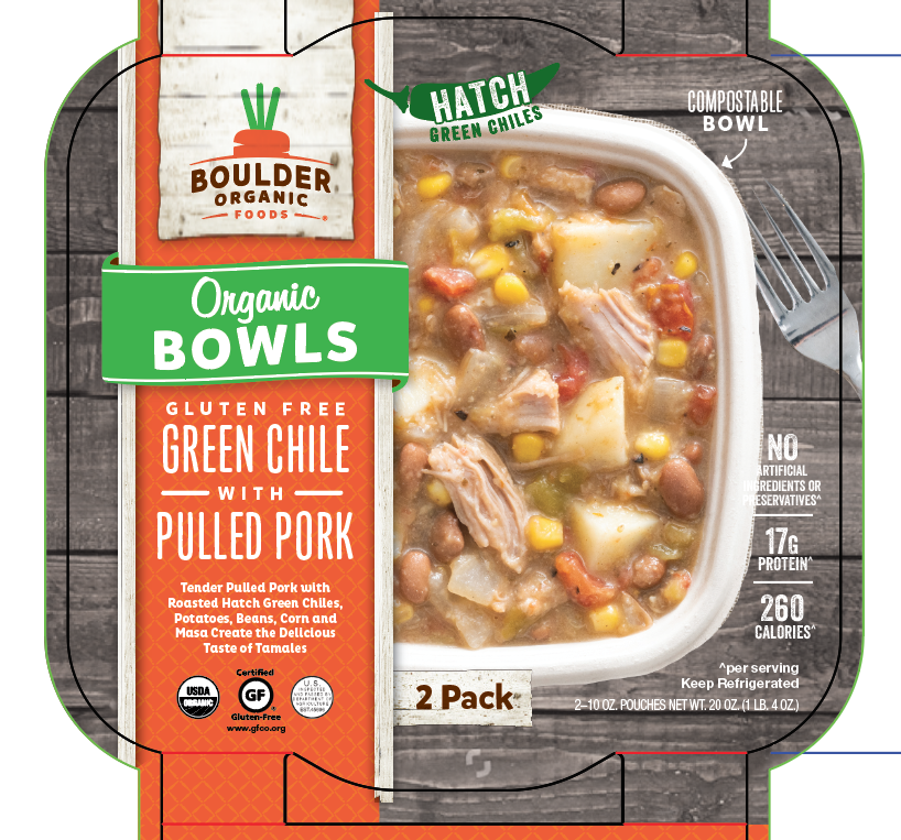
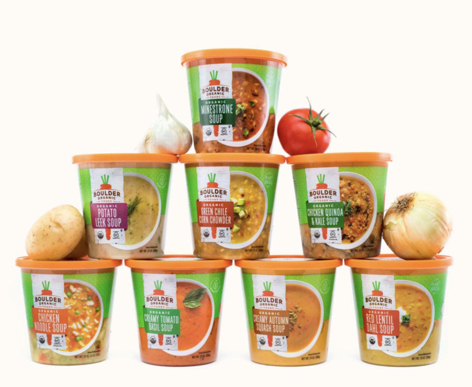
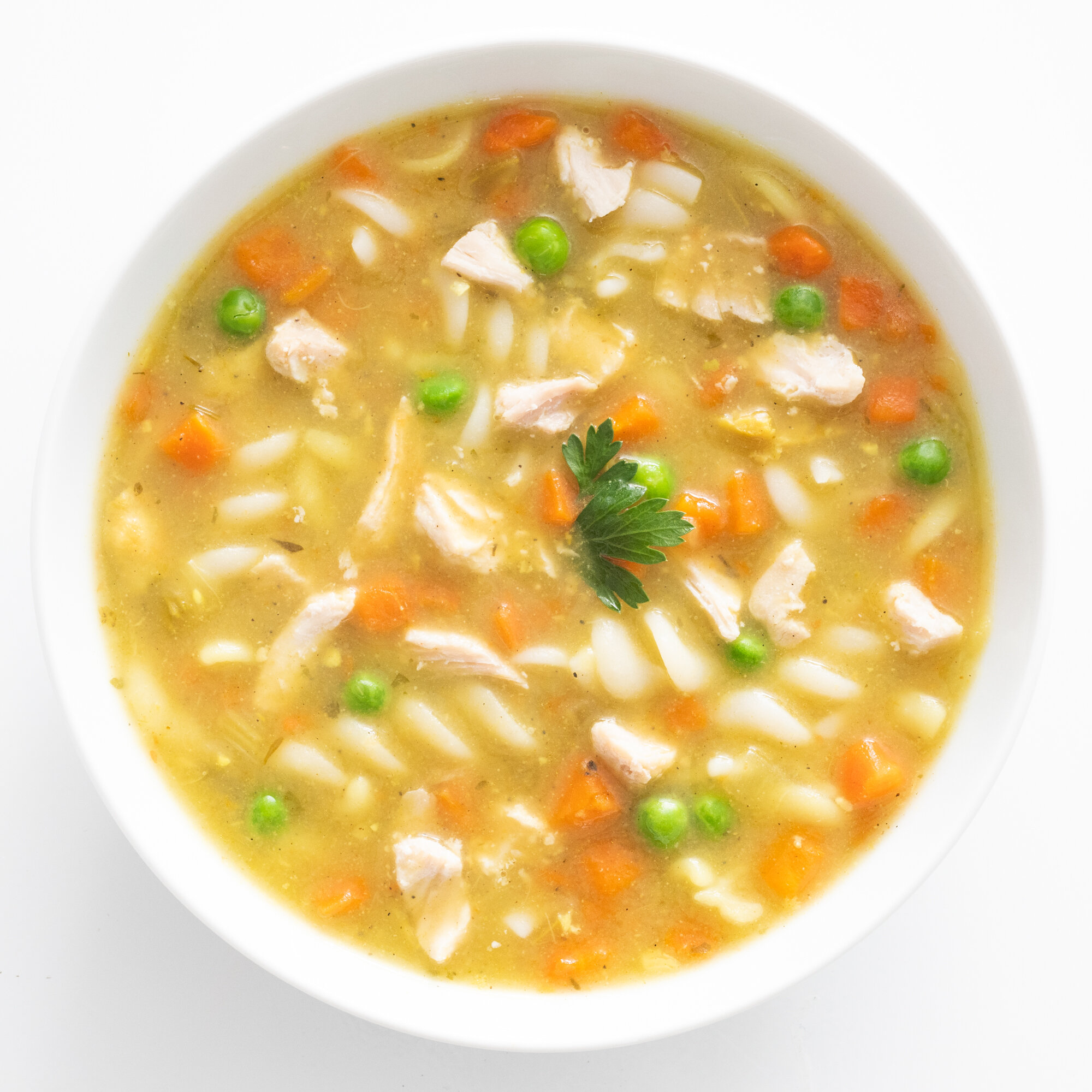
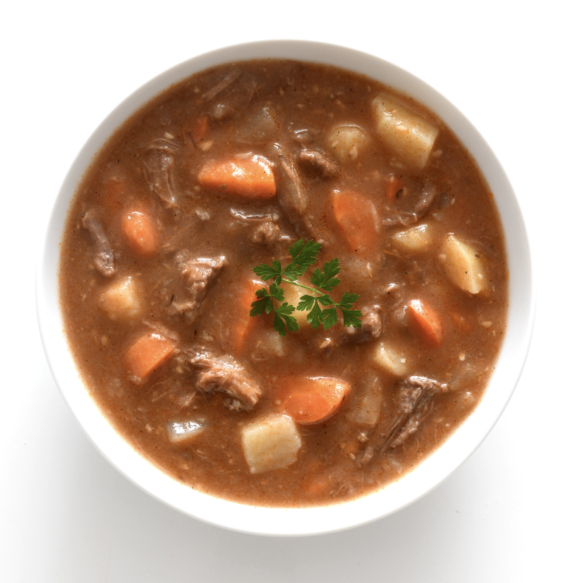
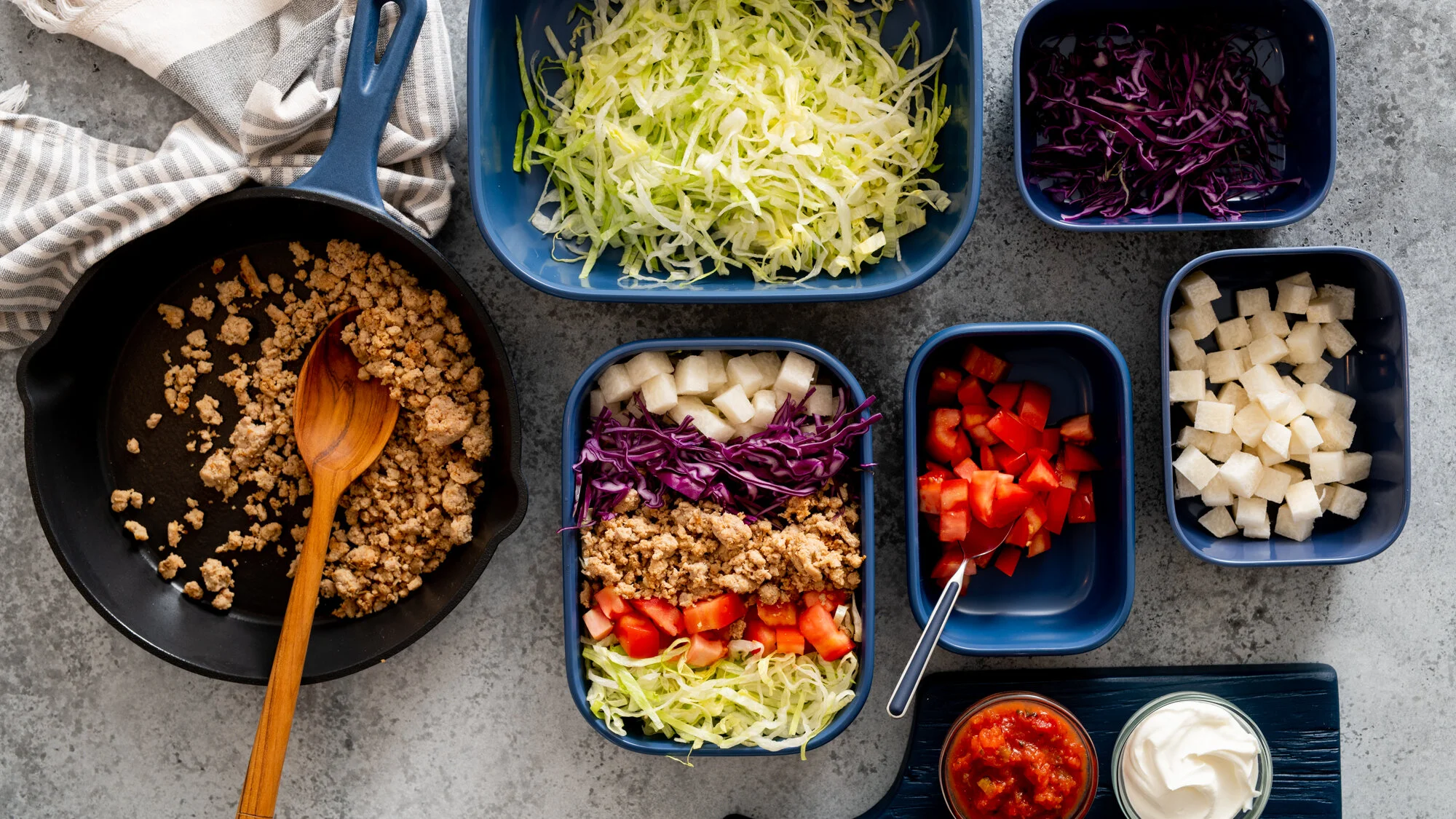
Boulder Organic Foods
These Boulder Organic photos give you an idea of the beautiful bowls I shot for them, and some close-ups of the yummy soups.


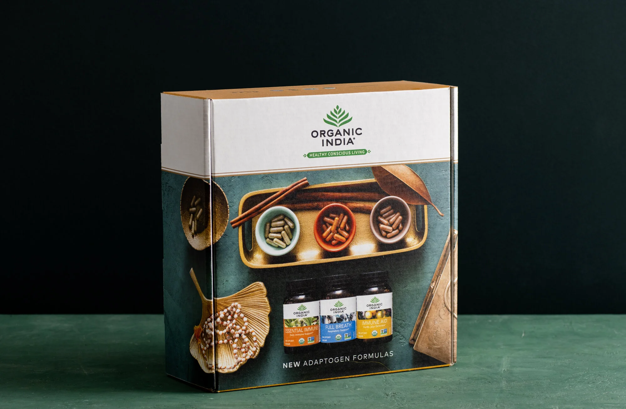
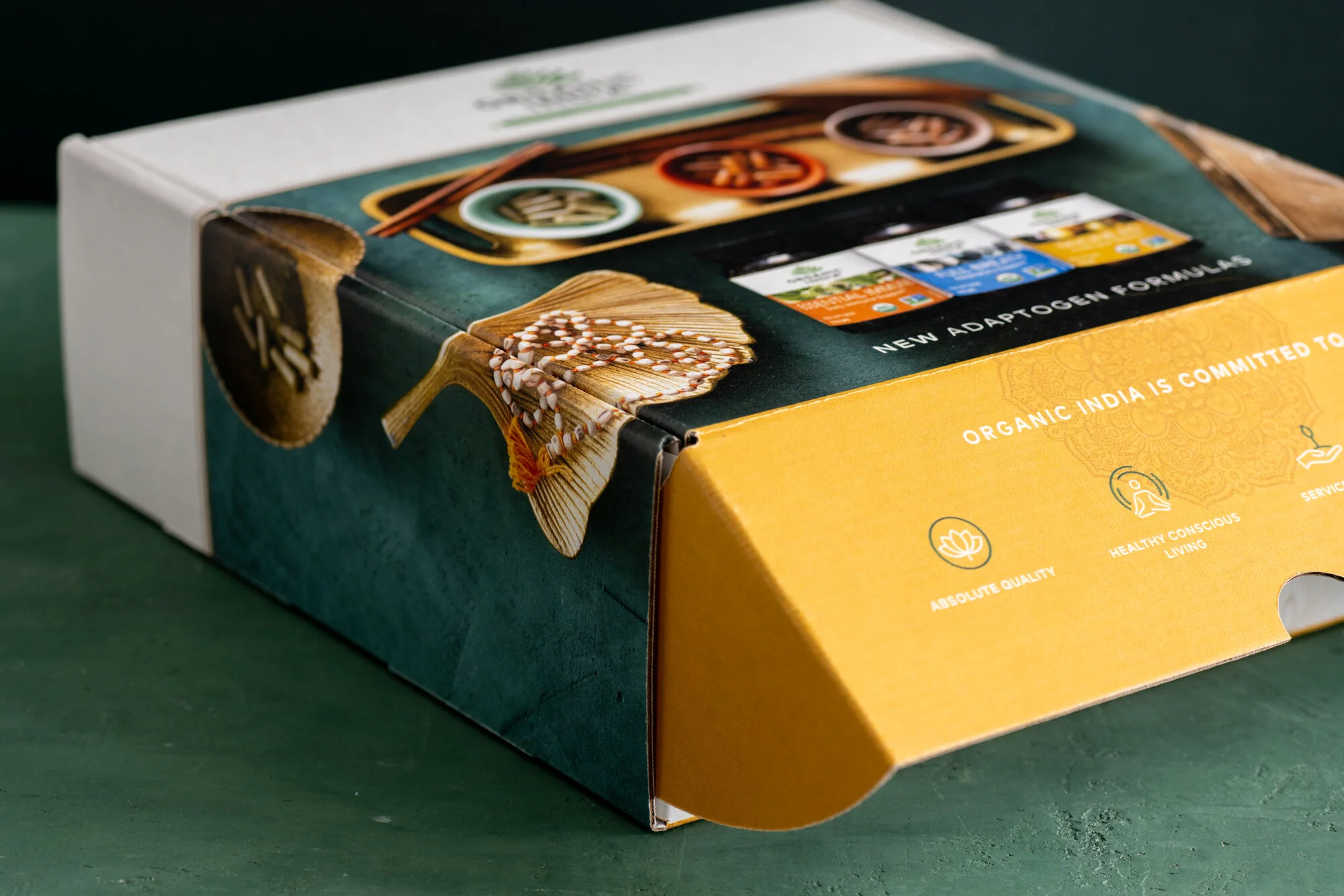
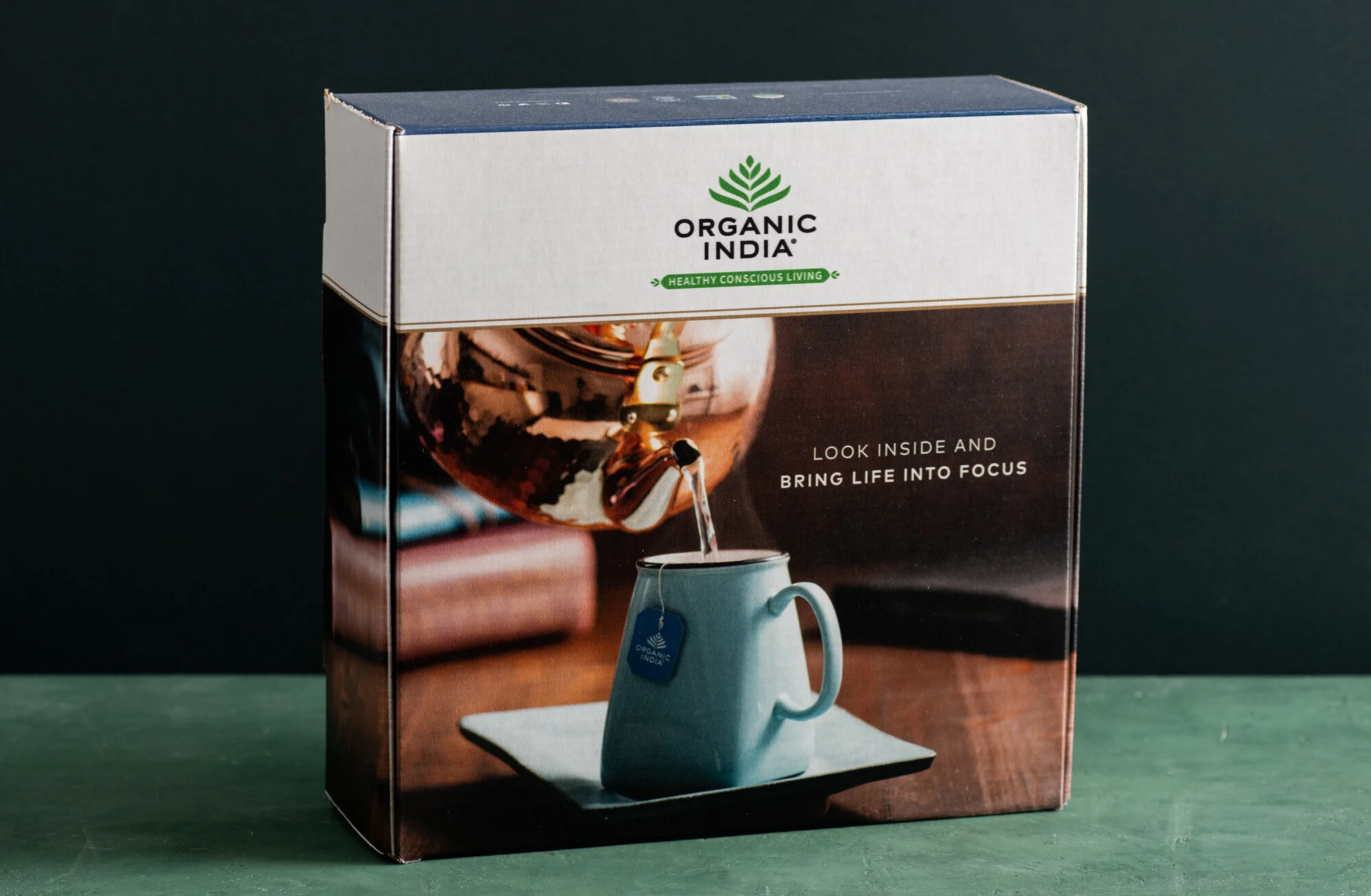
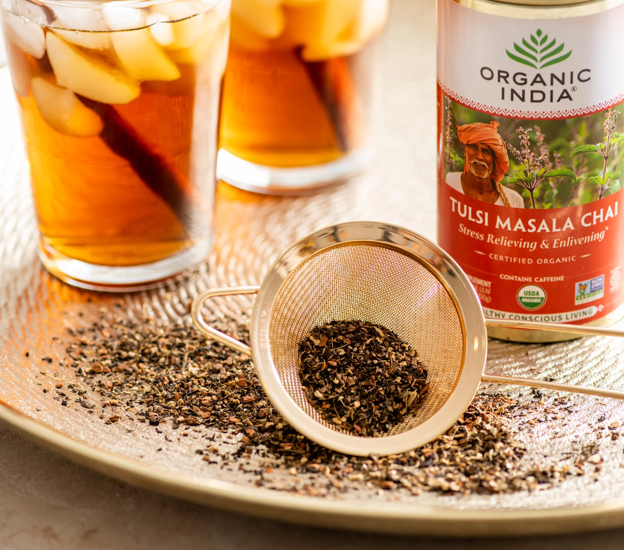
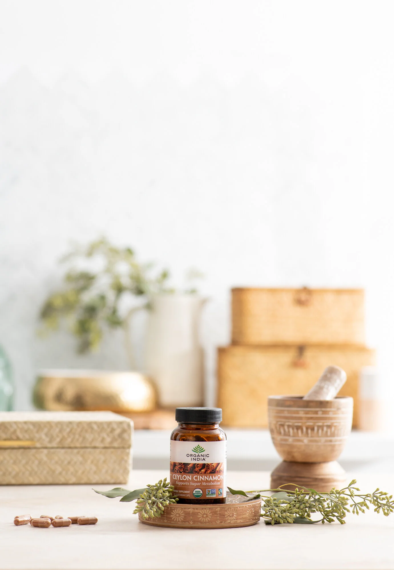
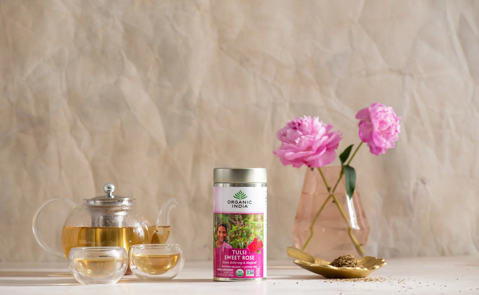
Organic India
A shot numerous images that run on their boxes, and photos featuring their packaging.


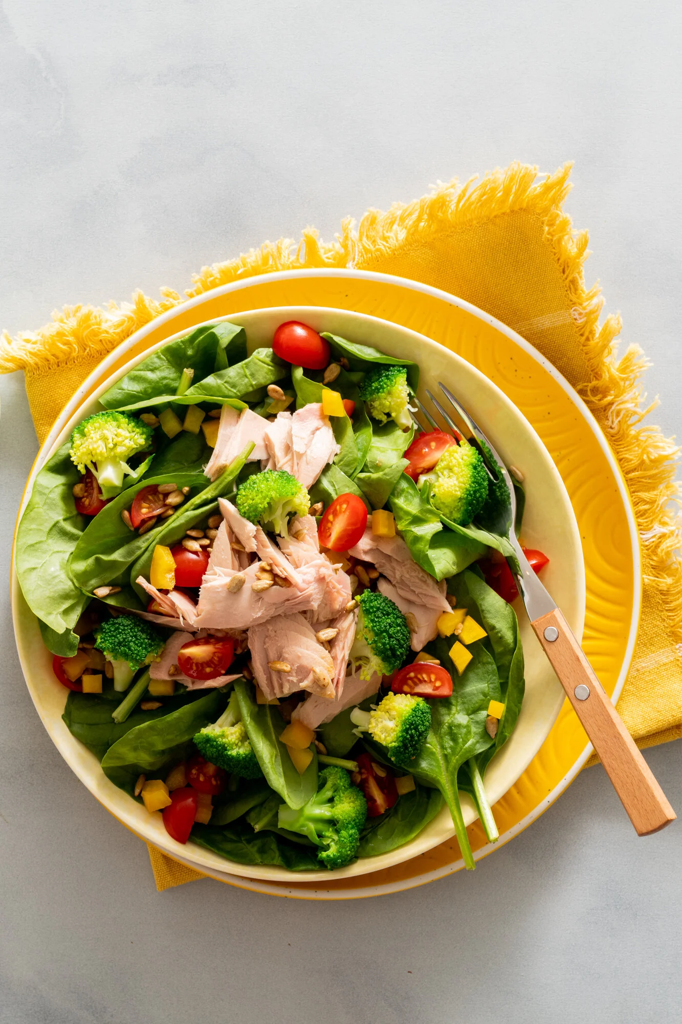
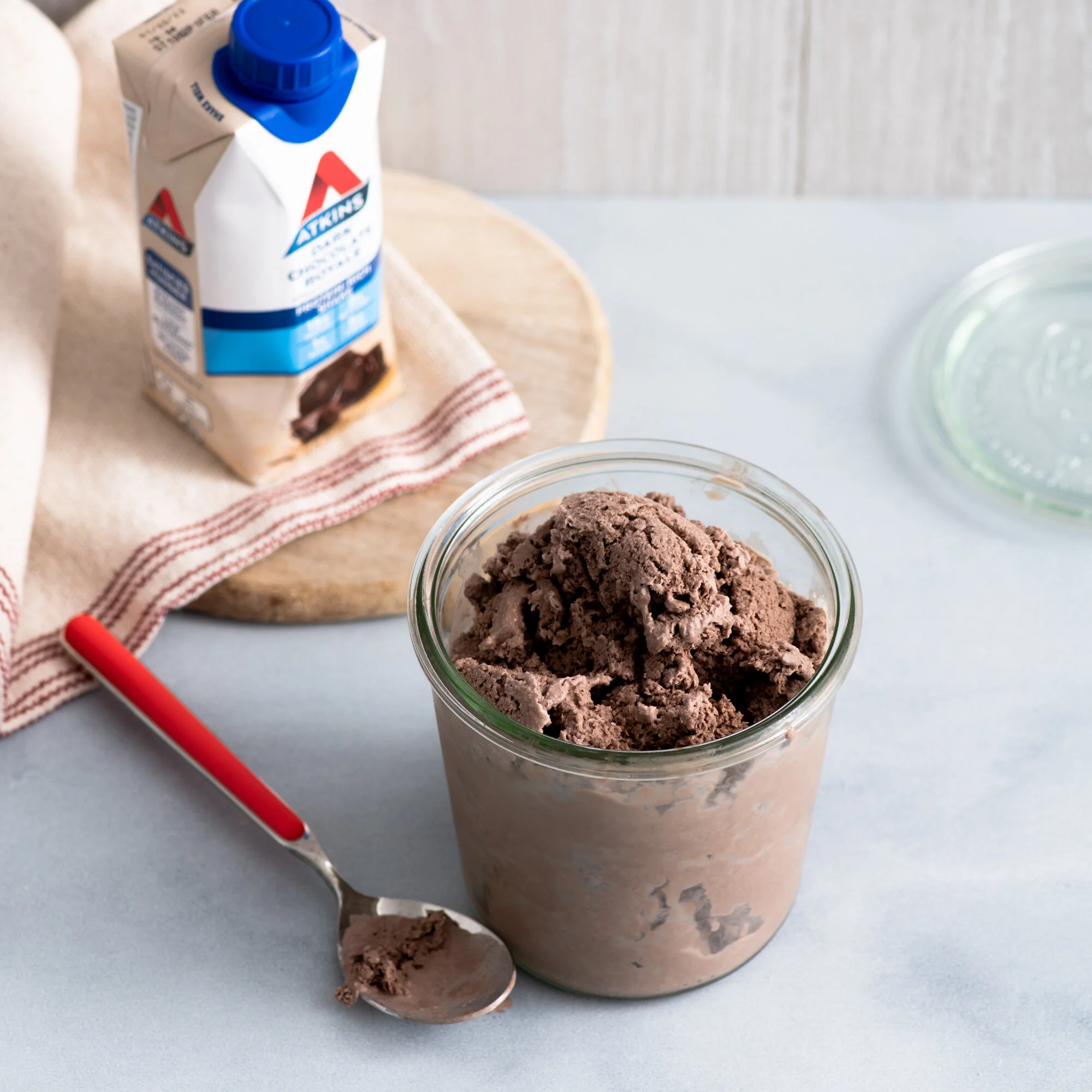
Atkins
While not packaging, I’m working with Atkins to reimagine their brand look and feel using their brand colors.


Last but not least, my favorite brand.
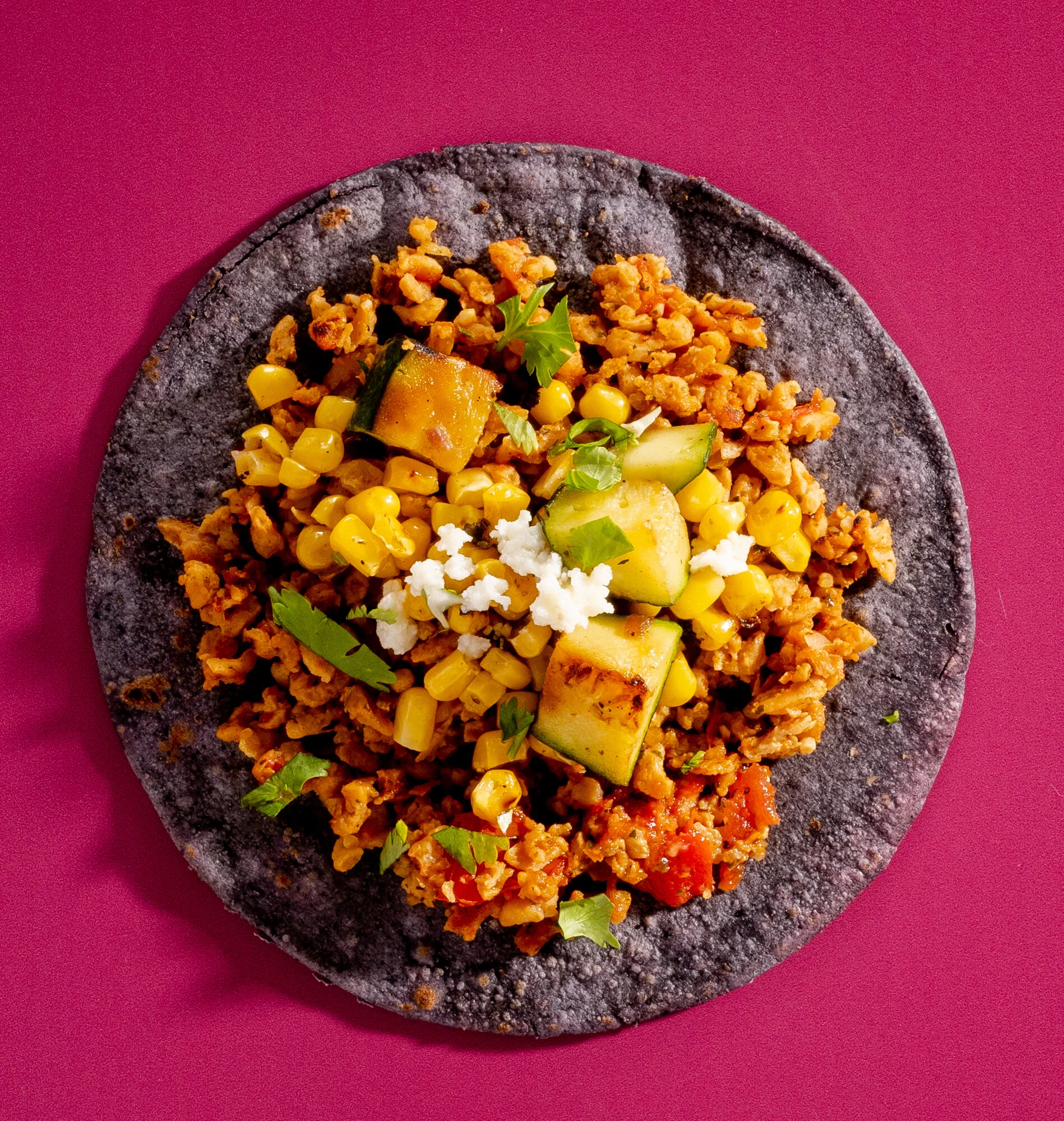
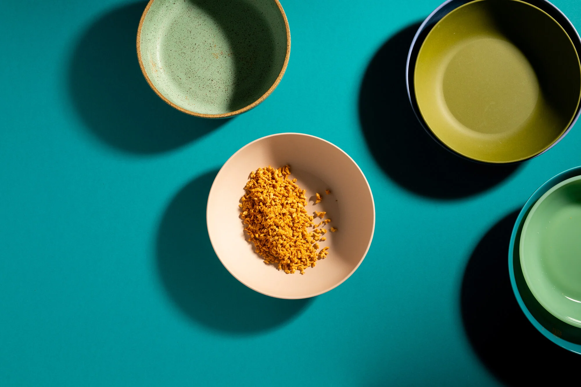
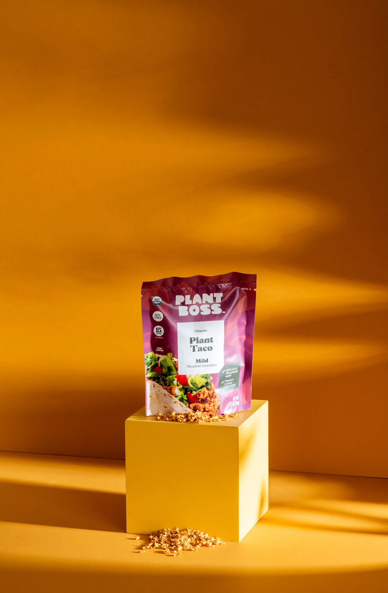
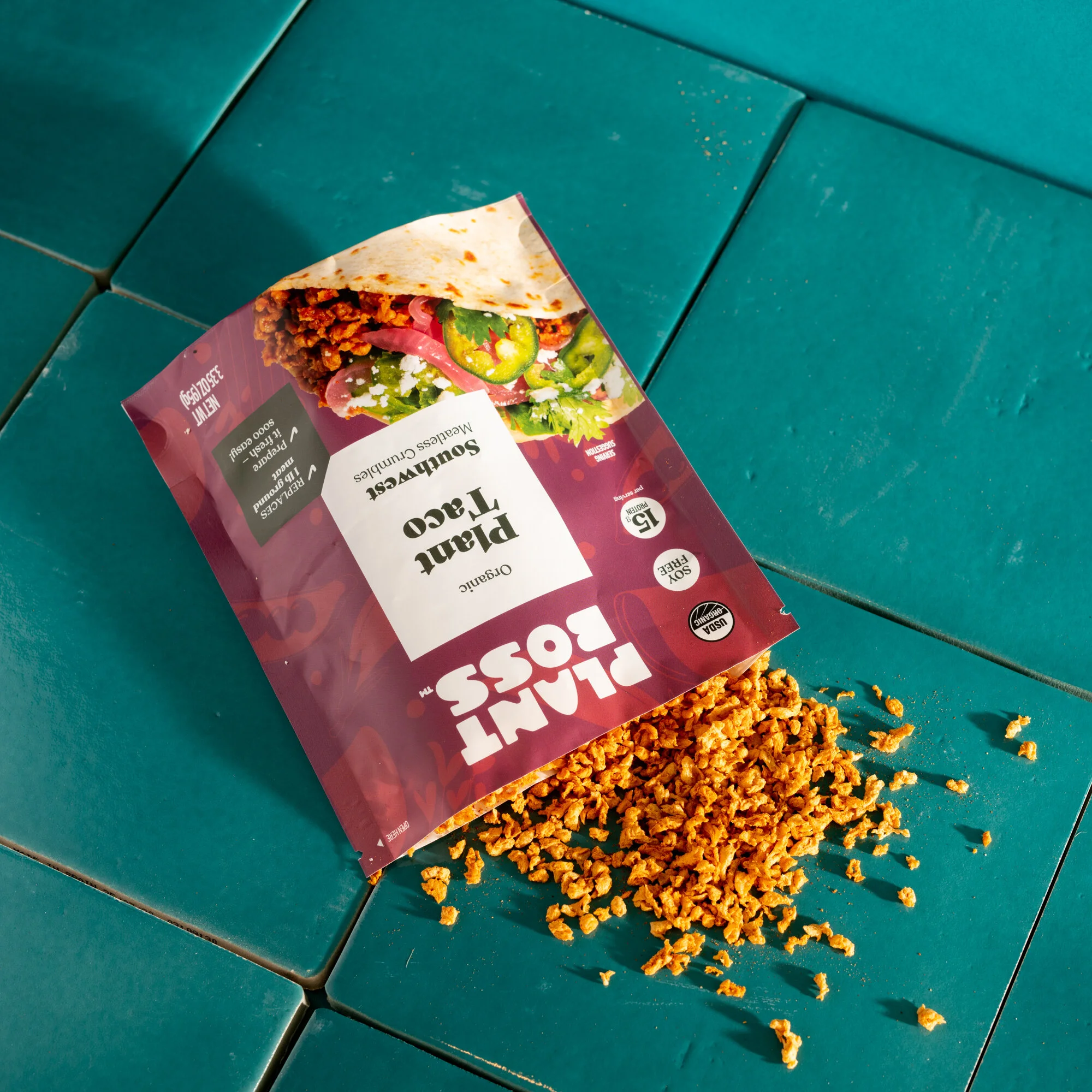
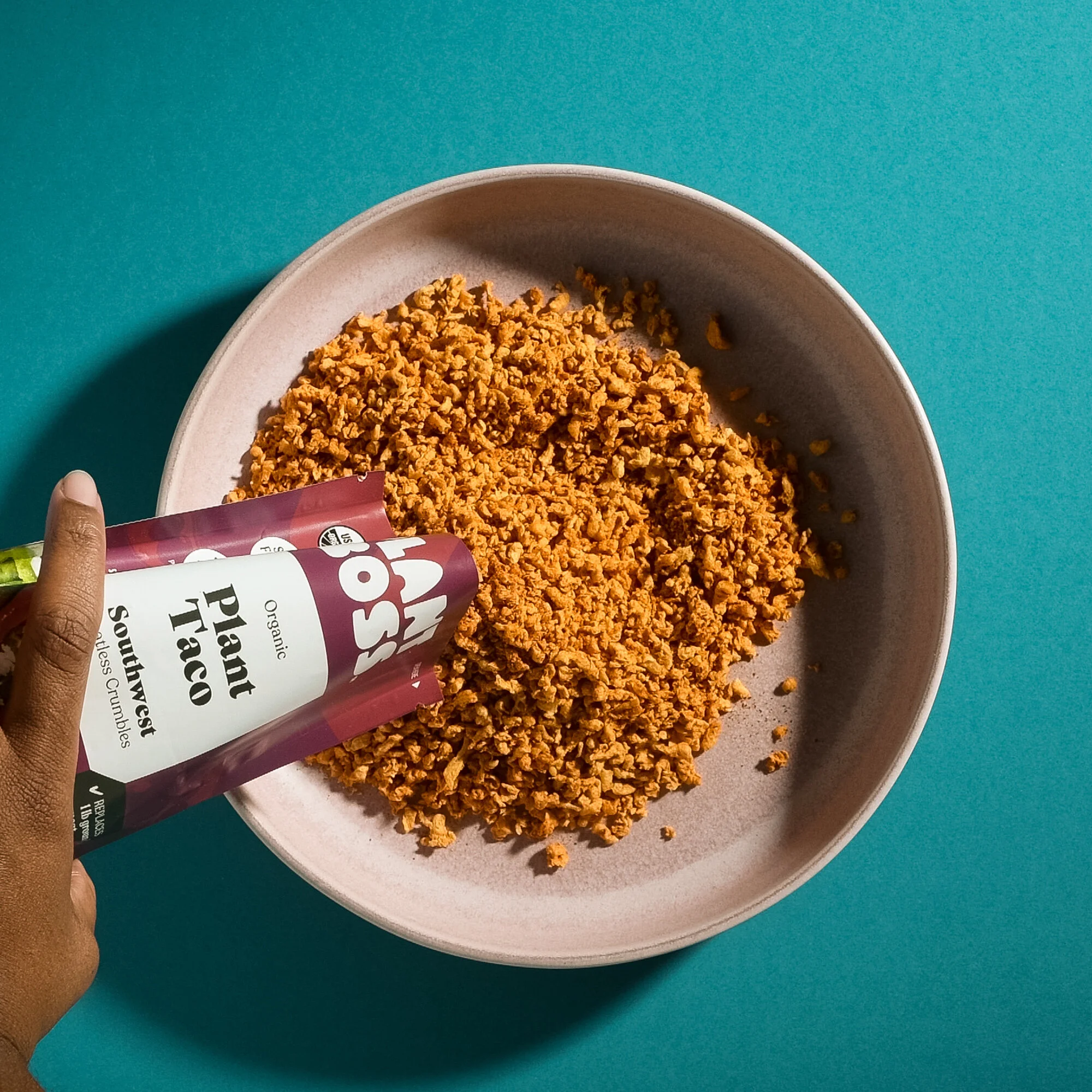
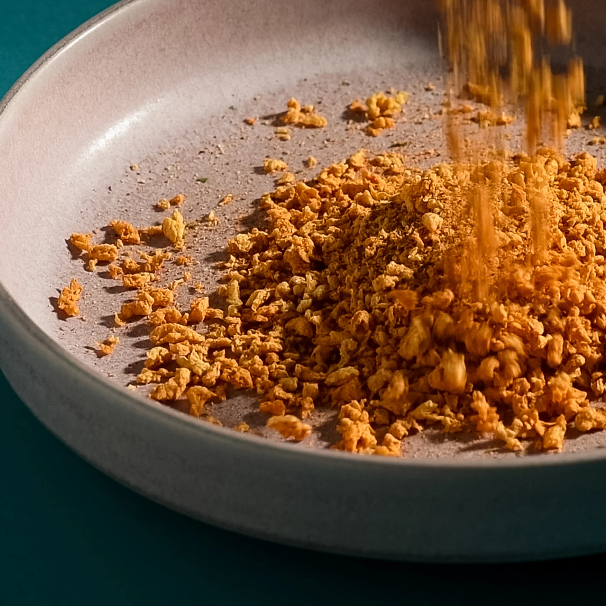
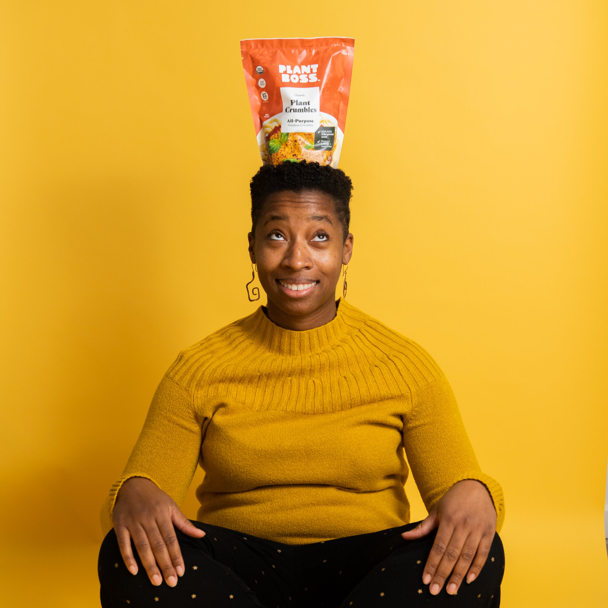
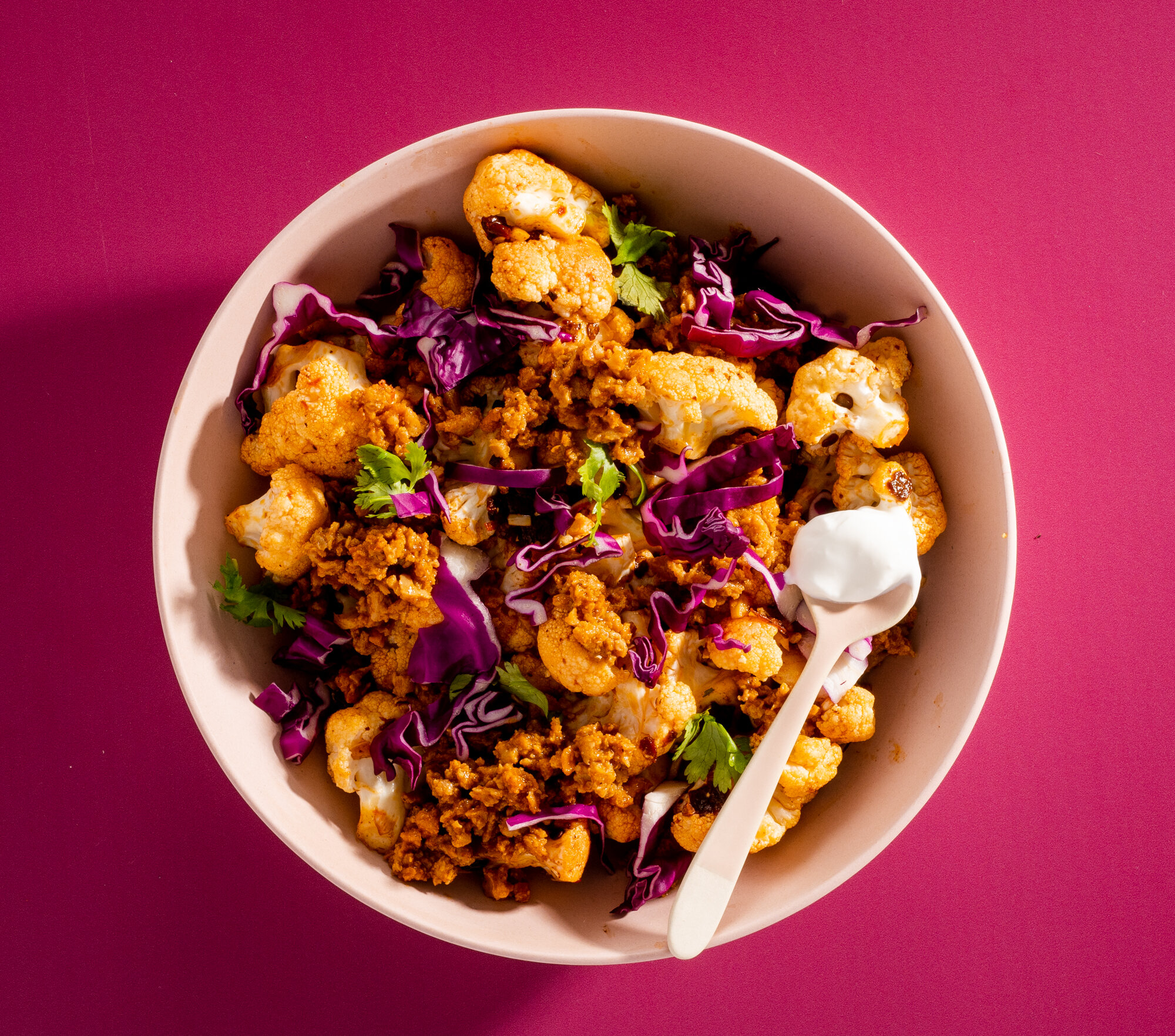
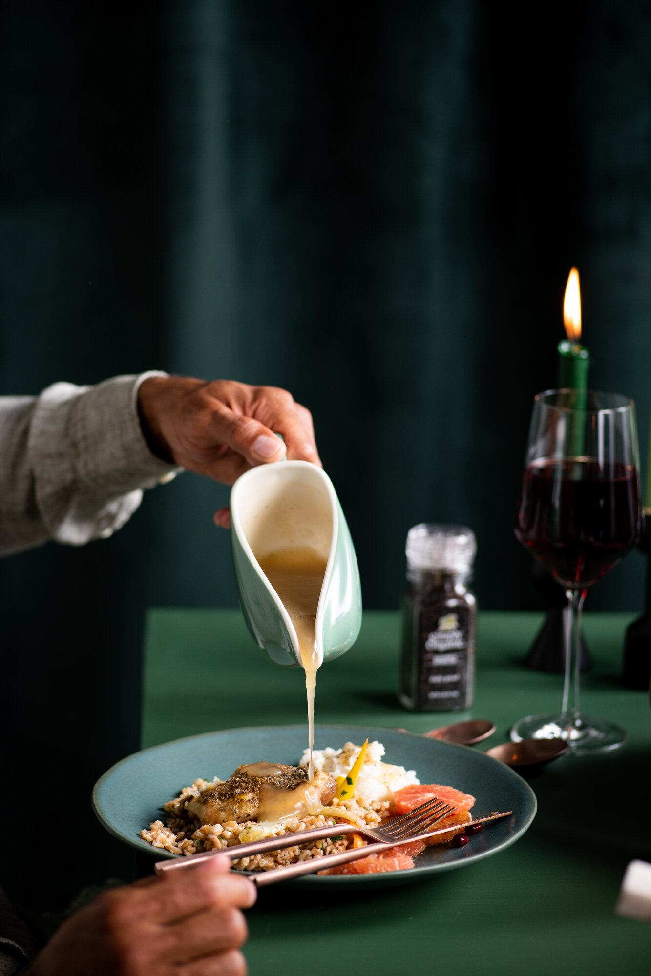
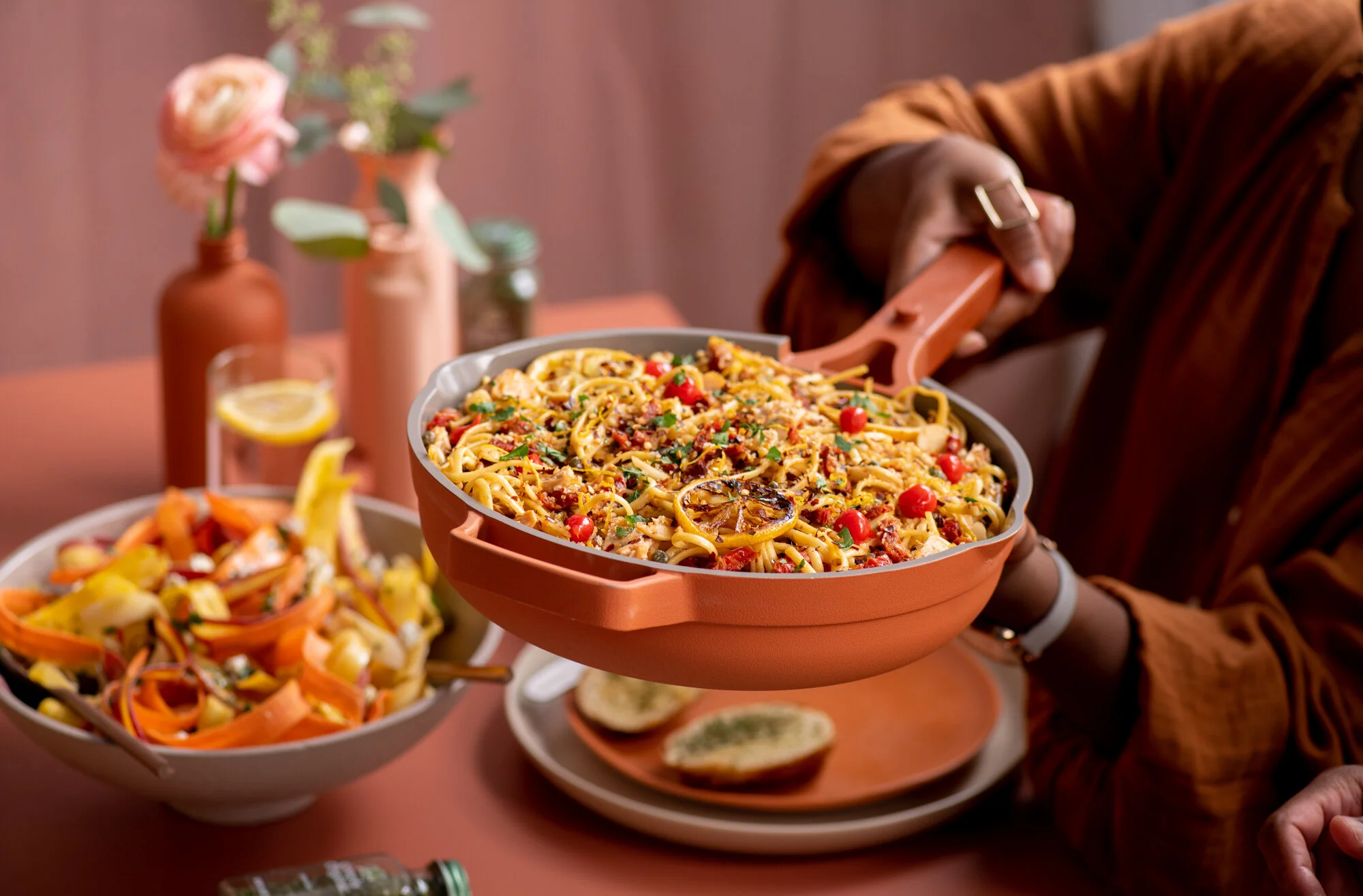
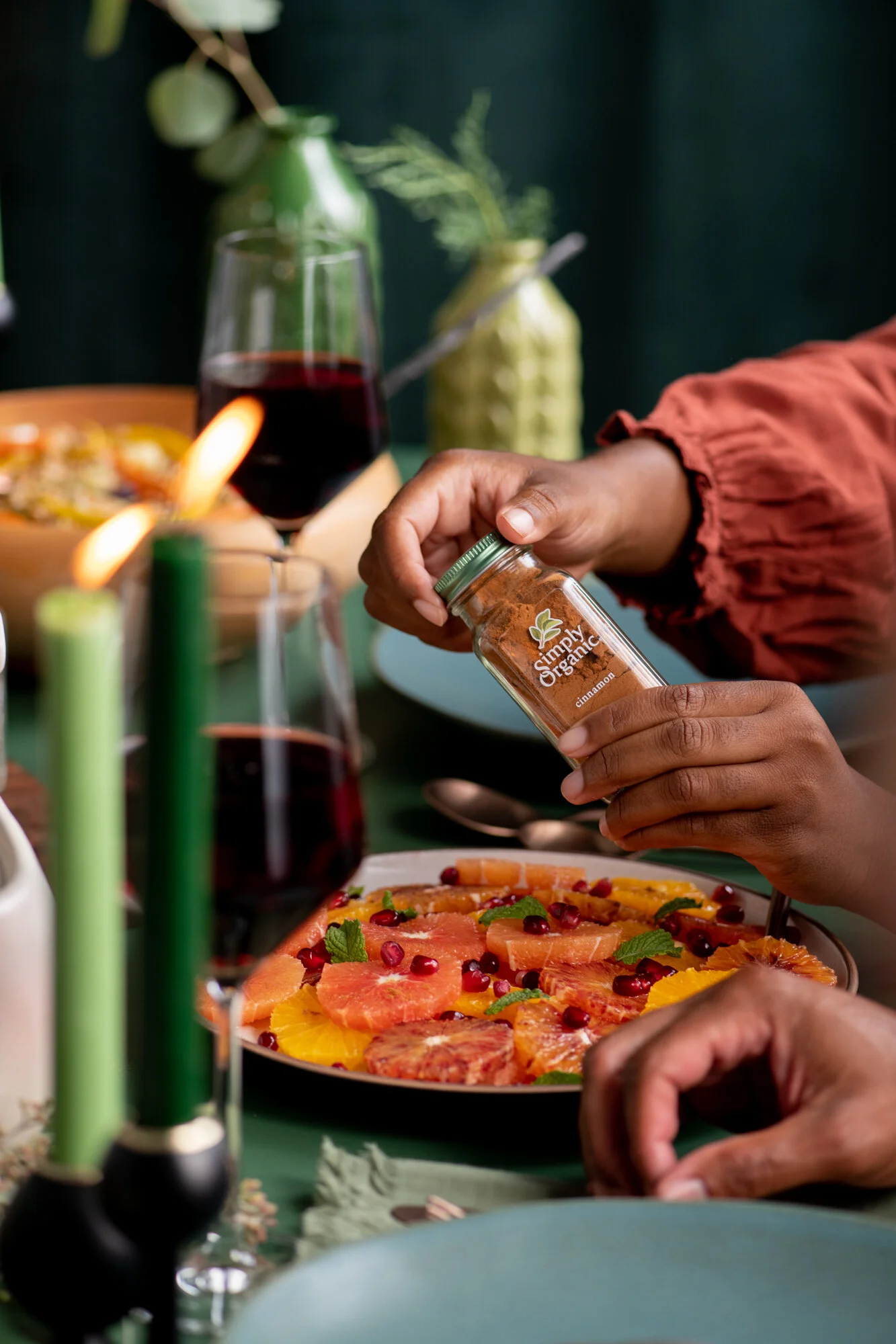
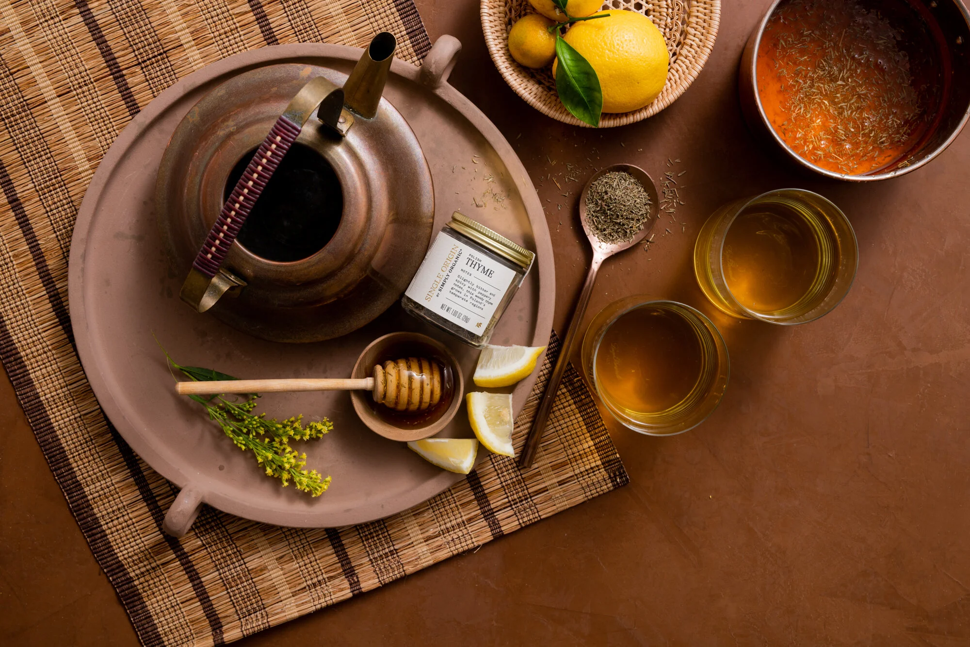
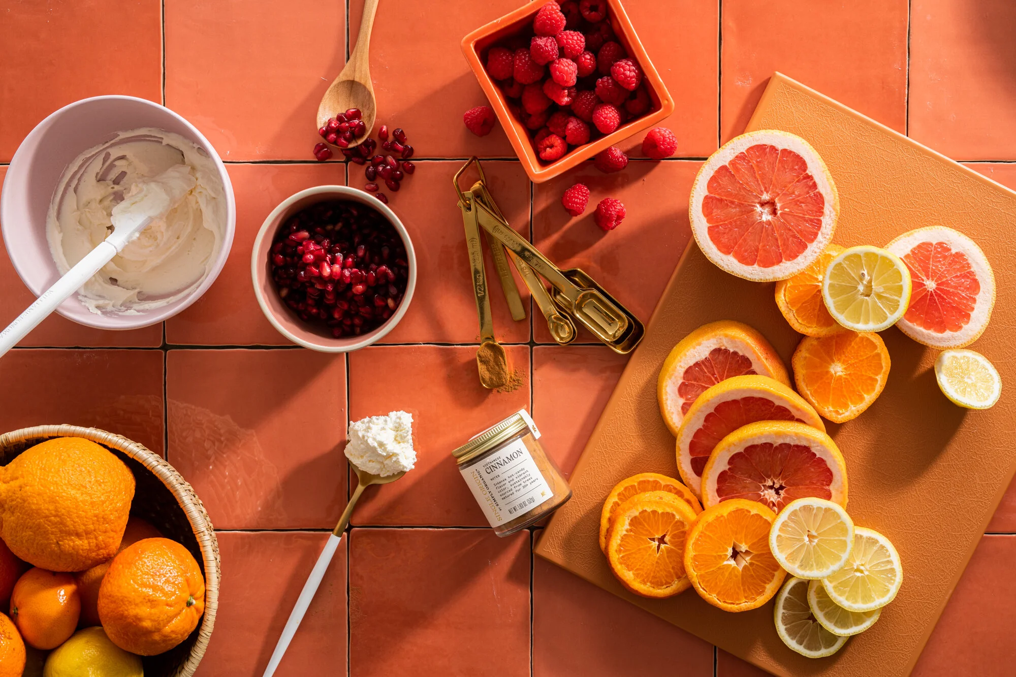
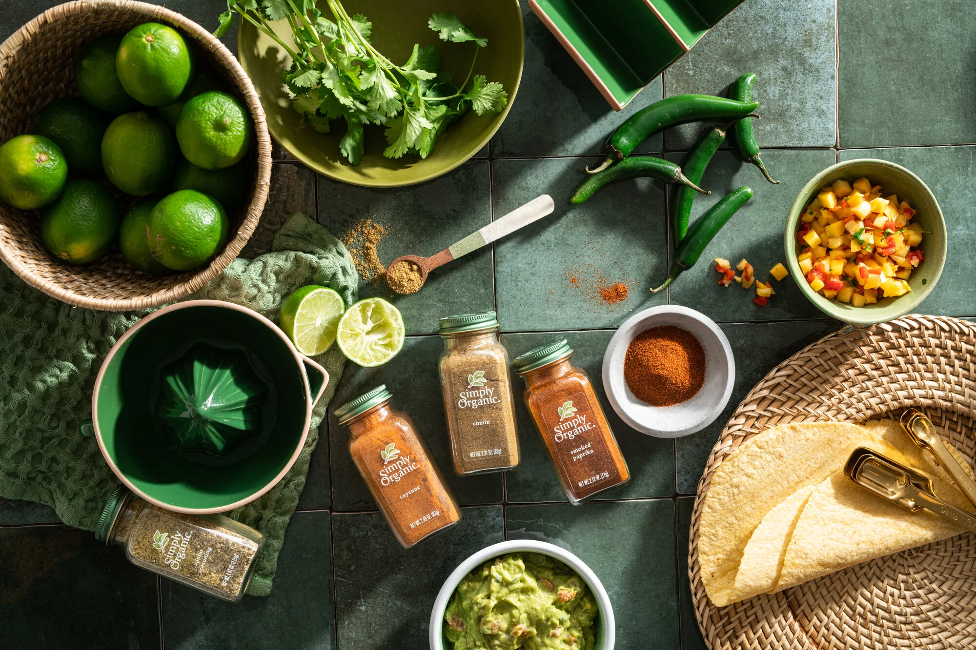
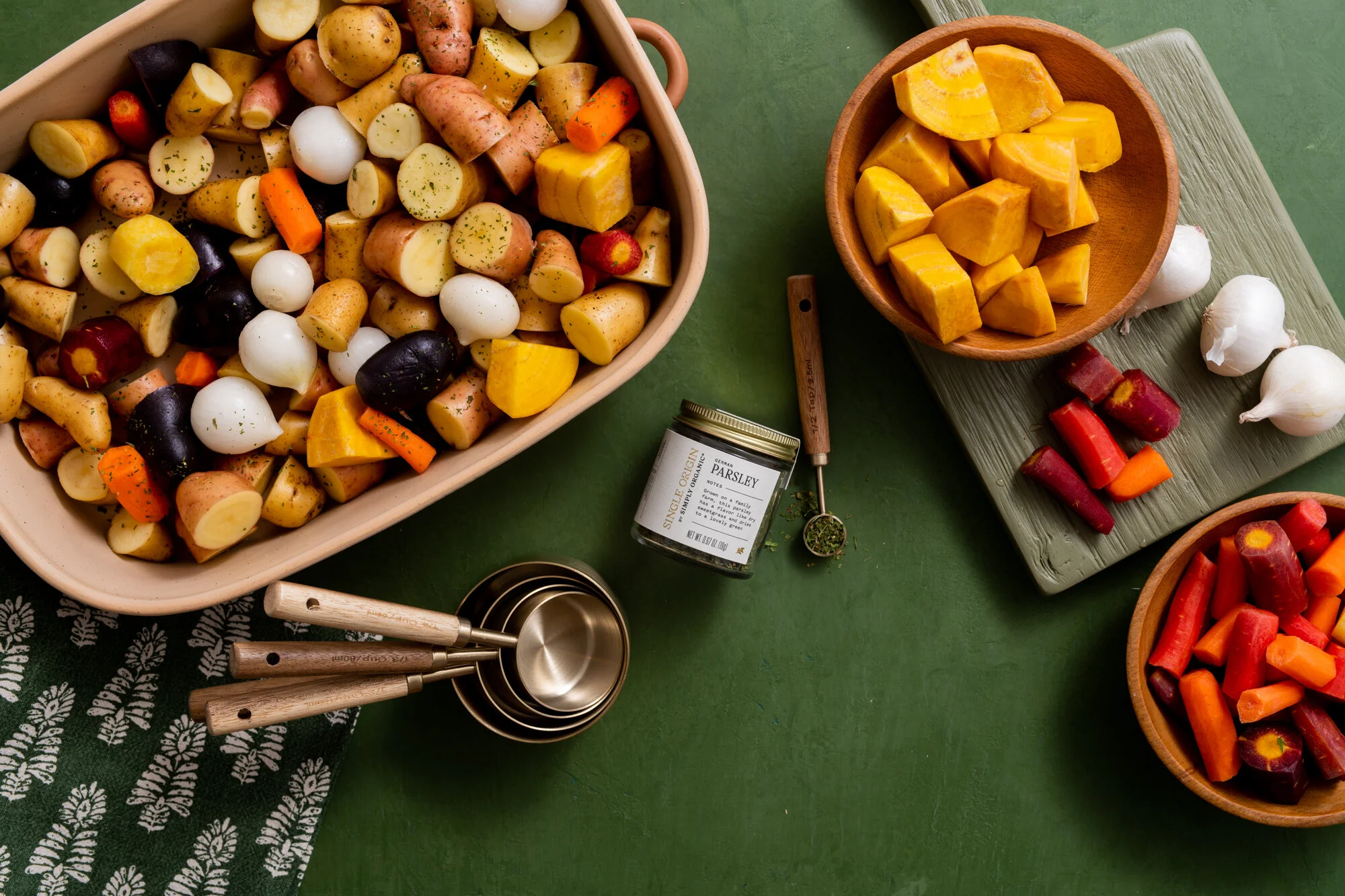
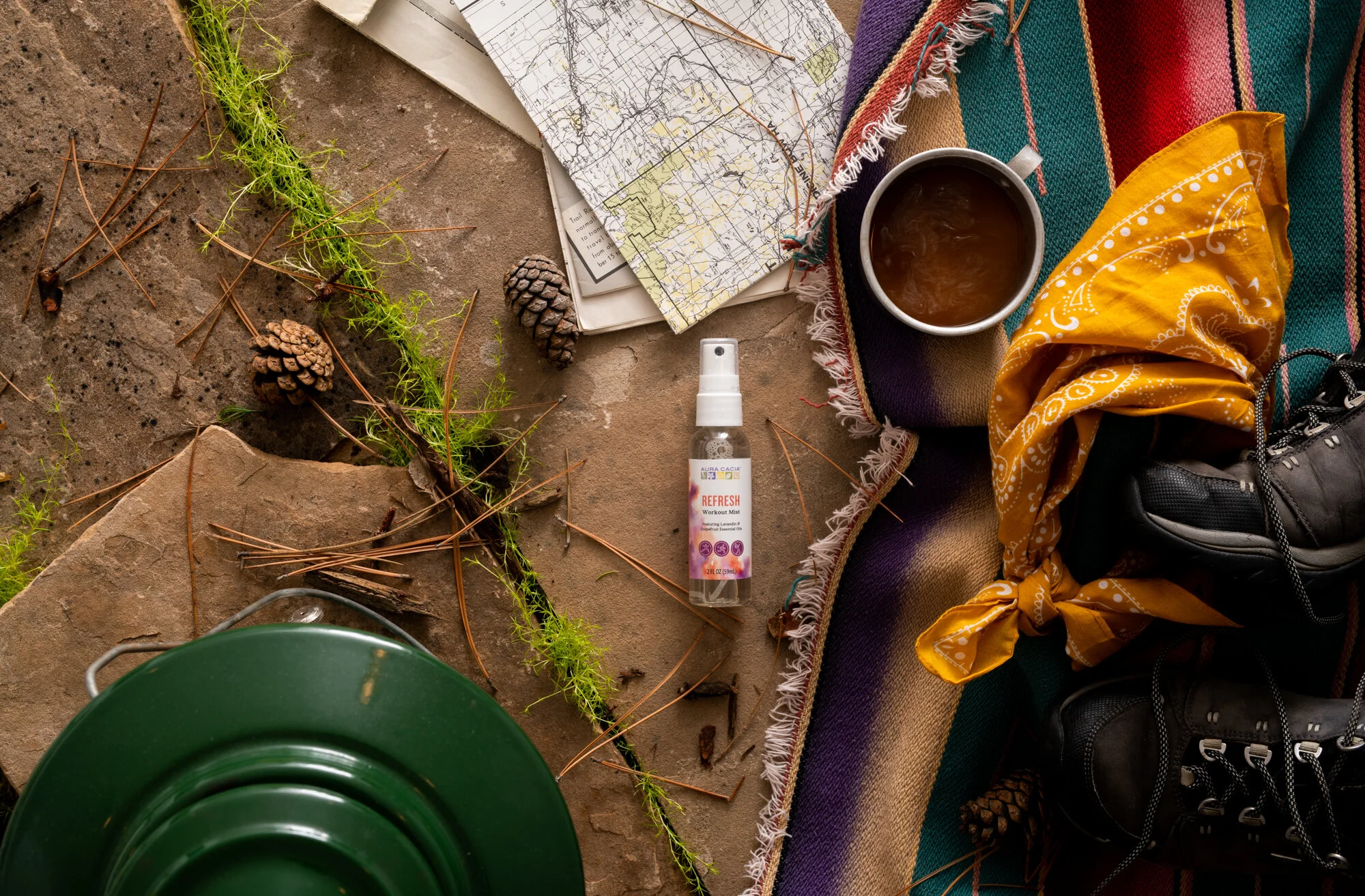
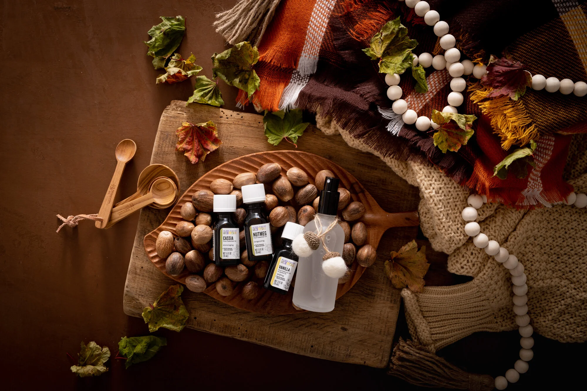
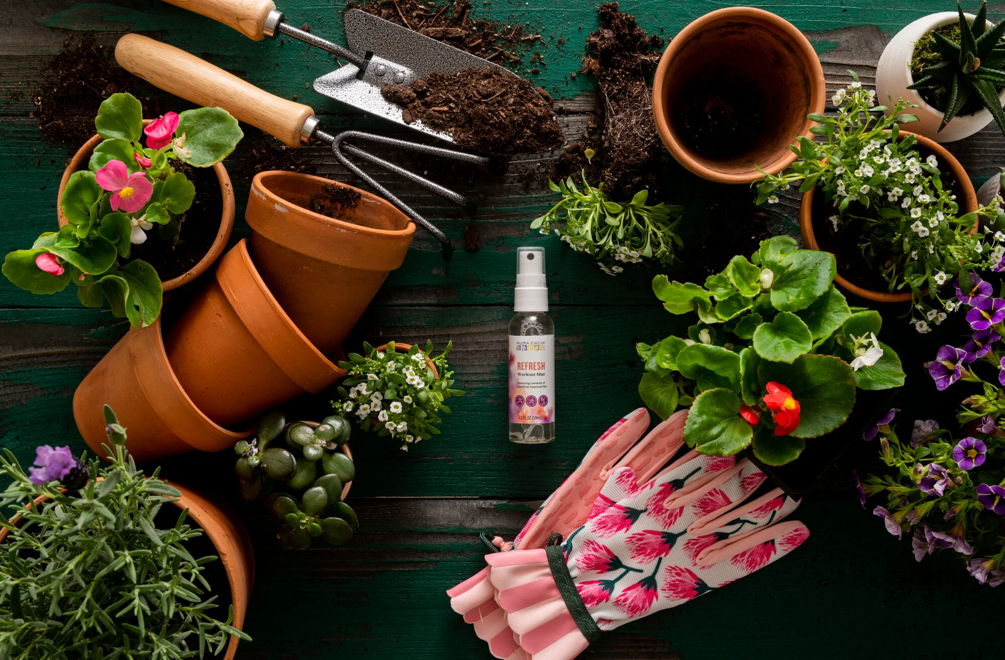
Frontier’s brands are numerous and varied in their styles: from Plant Boss’s vibrant, poppy look to Aura Cacia’s colors I’m involved in all of them. I’ve worked across the Frontier brands to create a variety of looks and feels. And over the years the brands have transitioned. Aura Cacia went from being light and bright to embracing the vibrancy of color. And, we’ve stayed true to Simply Organic’s light and bright roots, but have recently begun transitioning to a brand that uses more color. Some of my favorite work for Simply Organic comes just recently with the new look and feel of the Single Origin and holiday campaigns.
Whatever your new style is, I’m happy to help you create it.